Every client who has sat down for a serious tattoo consultation has faced this question at some point. Colour or black and grey? It feels like a binary choice — two distinct camps, two different aesthetics, two different kinds of artists.
It is not that simple. And the assumption that it is often leads people to make a decision based on the wrong criteria — personal preference in isolation, rather than what the work itself actually requires.
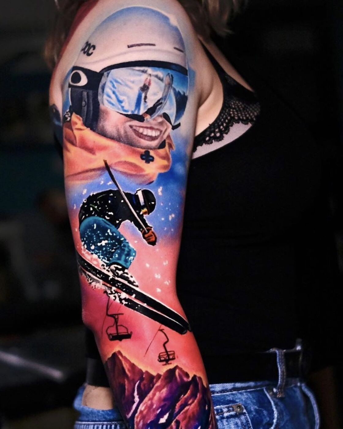
Colour sleeve · Modern Japanese Surrealism · Volkan Demirci, London
What each approach does well
- Timeless — ages predictably and gracefully
- Exceptional depth through tonal range
- Works at any scale from small to full sleeve
- Strong contrast holds on all skin tones
- Allows for fine detail that colour can obscure
- Generally heals more predictably
- Visual impact and vibrancy at a distance
- Allows for complex mood and atmosphere
- Japanese tradition — colour as structural element
- Contrast between warm and cool creates movement
- Saturation draws the eye and holds it
- When done with restraint — extraordinarily powerful
The question most people forget to ask
Most people approach this decision from a personal taste perspective: I prefer colour, or I prefer black and grey. That is a reasonable starting point — but it is not sufficient on its own.
The more useful question is: what does this specific design require? Some compositions need colour to work. Some subjects lose everything the moment you add it. The design, the subject matter, the placement, and the skin tone all have a say in the answer — and an experienced artist will factor all of them in before recommending one over the other.
This is one of the reasons a proper consultation matters. An artist who tells you "I only do colour" or "I only do black and grey" has already made the decision before seeing your brief. That is a constraint, not a recommendation.
The third option
This is not a compromise. It is a compositional decision — one that requires technical mastery in both disciplines and a clear understanding of how the two interact on skin over time. Most artists specialise in one or the other. Very few work fluently across both in the same piece.
"My colour palettes are usually based on contrast — and whenever I'm trying to create a design, at the end of the day it all looks like a yin and yang. I didn't try to do it on purpose but it is happening."
Volkan Demirci · Tattoo Life MagazineHow Volkan approaches colour
Colour is one of Volkan's most recognised strengths — acknowledged in international conventions, in editorial features, and by the artists who attend his workshops specifically to study his technique. But his colour work is not maximalist. It is controlled.
The palettes are typically built on contrast — warm against cool, saturated against desaturated, vivid against near-black. Two or three colours, used with intention, rather than a full spectrum applied across the entire piece. The result has visual weight without visual noise.
Factors that should inform your decision
The honest answer
There is no universally correct choice between colour and black and grey. There is only what is right for this design, this body, this person — considered together.
What matters is working with an artist who understands both, who has a clear opinion based on your specific brief, and who can execute whichever approach the work demands. The palette should be a decision made in conversation — not a fixed offering on a menu.
Volkan Demirci works in colour, black and grey, and combinations of both — chosen for each commission based on what the work requires. Every project begins with a conversation about exactly these decisions.